Project
My role
Primary Research
Our Solution
Development
Design Practicality
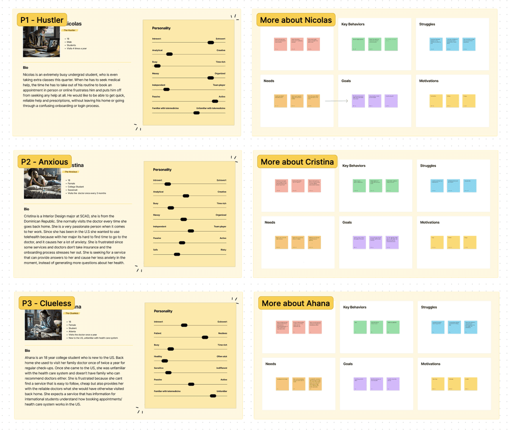
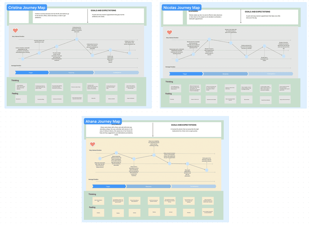
To determine how exactly we could improve and build upon the common telehealth experience, we created archetypes that fit segments of our audience, and then went on to build personas and journey maps for those archetypes.
We made sure KERA's design styles and components were all accessible, keeping in mind a set of reasonable design guidelines.
Feedback from user testing allowed us to make improved iterations of our screens before moving to high fidelity work.
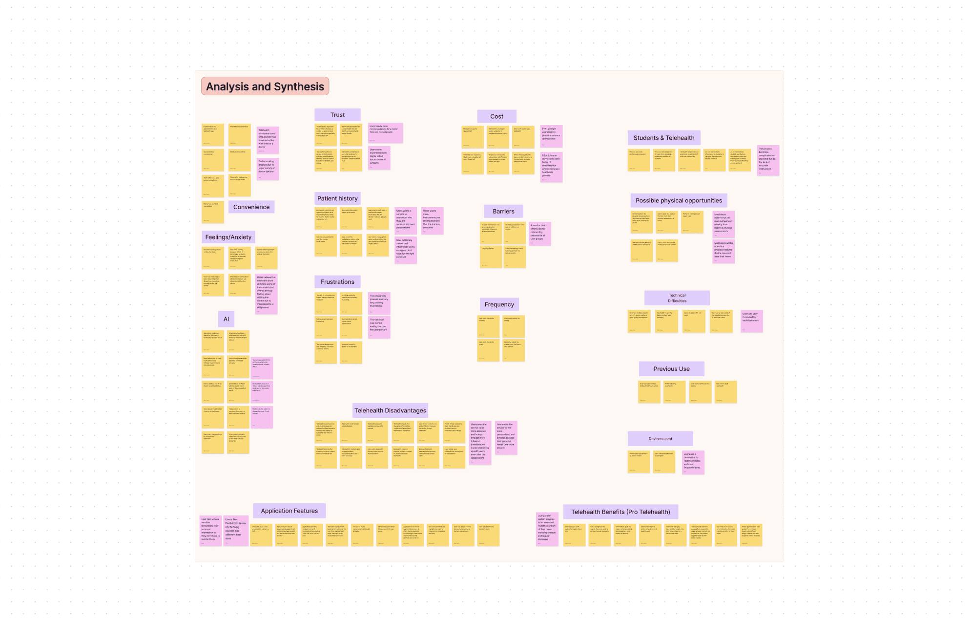
After completing this process, we analyzed our data and responses, then pulled our most important overall insights through affinitization.
We narrowed our audience scope to college students with anxiety around doctors' visits, finding that they struggled the most with existing services.
We learned users were currently struggling with the onboarding and appointment booking processes, and that users were strongly averse to AI taking center stage in their care. Our users felt anxiety about AI replacing humans in their healthcare.
In addition, we found that users feel anxious about telehealth in general because they feel it isn't the same quality as an in-person visit; they feel they don't receive enough follow-up support and that the care isn't personalized or helpful enough.
A one-stop telehealth app designed for college students, KERA gives users a say in how much AI is involved in their care and visit experience.
A 10-week long design sprint. The prompt: Create a product to attempt to solve an issue caused by currently emerging technology.
As project lead, I delegated tasks to the team, ensured work was completed, gave the team feedback and kept our main goal in mind.
I worked with the rest of the members on our final deliverables, specifically taking a lead in UI Design, Prototyping, and our final models and video.
Keeping telehealth human.
In the whirlwind of college life, juggling deadlines, projects, and a heavy workload can leave little room for traditional doctor's visits. With an average of four medical visits per year, in-person appointments pose increased inconvenience to college students, wasting valuable time and often lacking the flexibility needed in their busy student schedules.
That's where telemedicine becomes a lifeline, providing college students with a much-needed alternative for accessing healthcare on their own terms. However, in the quest for efficiency, many telemedicine apps seem to forget the essential human touch, burying users with overwhelming new AI technology and detached experiences.
As AI begins to become more prevalent in telehealth products, how can we…
Keep the telehealth experience personal and comfortable while incorporating AI?
Bring telemedicine capabilities closer to seeing an in person doctor?
Make the onboarding process more streamlined and convenient for users?
Insights
Users want a service to remember who they are, generally do not trust AI, and want the service to feel more accurate, reliable, and in-depth.
At the end of our research process, we concluded that the main pain points in the telehealth process were:
Lack of choice in AI implementation
A long and complicated onboarding process
Anxiety before and after appointment
Lack of instruction / help navigating the app
As telehealth continues to evolve, an option that offers users control over exactly how AI is factored into their care could be a welcome respite from the forced AI usage many industries are starting to implement.
Opportunity Areas
Carefully evaluating those user journeys, we found specific, defined areas of opportunity where our new product could improve on the norm.
Provide users with the option to implement or remove AI
Simplify and shorten onboarding
Provide instant assistance for anxiety
Simplify interface, make easier to navigate
KERA
Our finalized concept became KERA, a highly personalized one-stop telemedicine app that allows users to book appointments, receive one on one consultation and access their medical records securely from anywhere. Its differentiating factors are its simplified experience, chatbot assistants that guide the user through the booking process and moments of anxiety, and the choice consumers are offered to incorporate or exclude the AI entirely. So, where did we go from there?
Late Development
As we moved into our final iteration, we made several changes to each of our planned features to acommodate user feedback.
Added a separate screen for anxiety and stress
Created a mascot
Separated color schemes for medical vs anxiety help
Added more resources for anxiety and stress management
Find a doctor based on symptoms
Summary page post appointment with doctor's notes
Cohesive margins
Clearer text hierarchy


Needs a face
Separate page
Clarified instructions
Too many choices
Should show credentials
Confusing interface
Crowded screens


Users strongly dislike having AI features imposed upon them - a short questionnaire during onboarding determines which AI-powered features a user might like to see, and which screens to exclude from AI from.


My takeaways
KERA was my first experience with a full 10-week design sprint. I learned so much about the process that I had never heard of before or had little experience with; I also got valuable practice with skills like audience research, persona development, journey mapping, UI design and iteration, prototyping interactions, and more.
During this project my skills in Figma rapidly improved, and I feel much more capable as a designer. My greatest challenges were learning the software, understanding the UX process, and managing all the members of my team.
Were I to take on this project again, I would utilize the knowledge I now have about more advanced applications of Figma to improve the overall visuals and construction of the prototype. Though this project was invaluable practice of the UX process, looking back I can immediately see many things I would now change or design differently.

What is KERA?
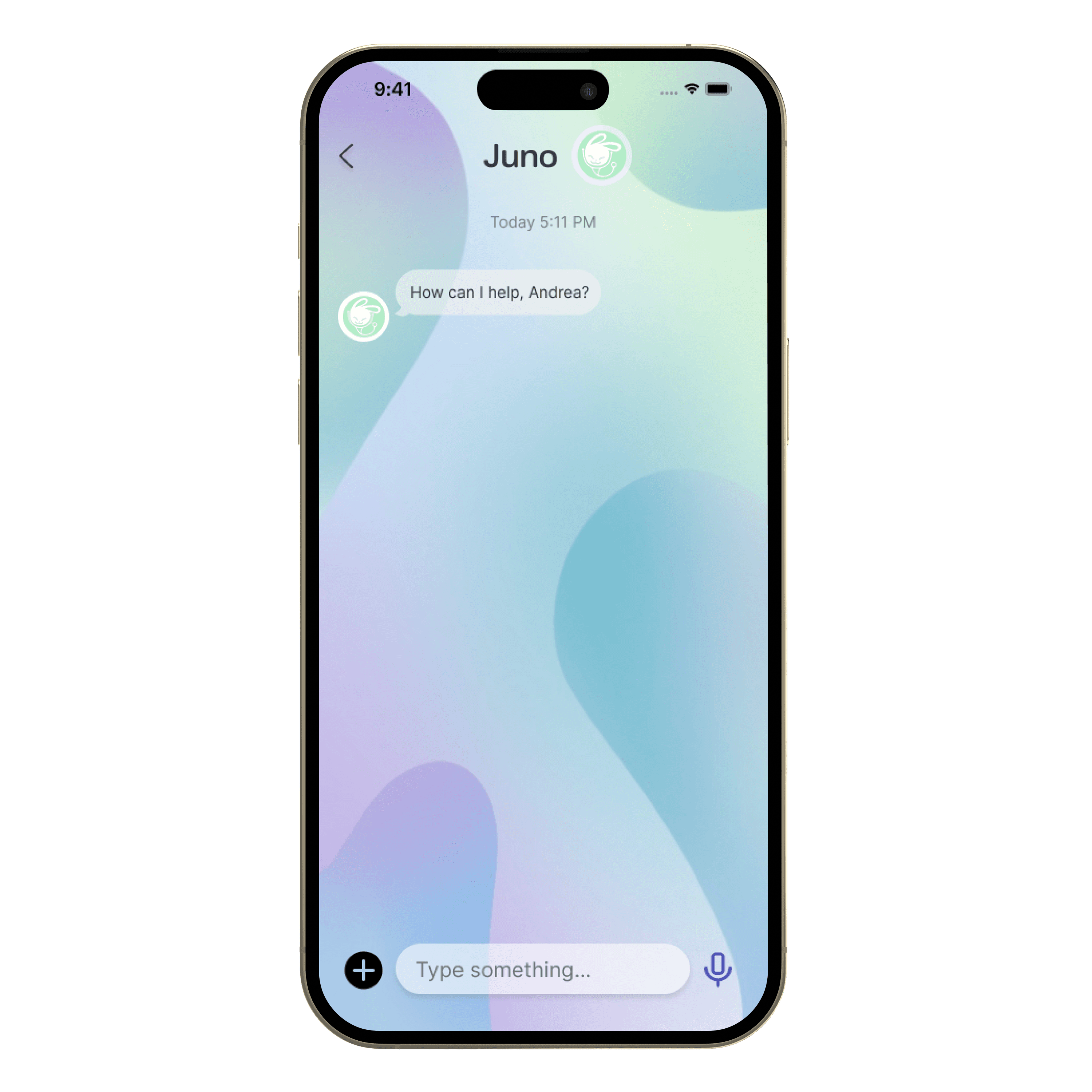
AI Assistants Freya and Juno offer support for anxiety and simple medical questions respectively throughout the process. They get to know the user and help provide more personalized care.
End-to-end support before and after appointments to help users feel secure in the quality of their care.
Recommended doctors based on symptoms the user is experiencing and their indicated provider preferences, to streamline the booking process.
AI makes Kera more instant and convenient. It sets itself apart by allowing users to opt out of any AI-powered features they choose for a totally human experience.
Home
(With AI)

Home
(Without AI)
Our final screens were all prototyped in Figma and tested one final time. Read about its final features at the top!


